The ngx-smart-cropper component is an Angular standalone component that allows users to upload, crop, and resize images with ease. It provides intuitive drag-and-resize functionality, grid overlays, and supports various aspect ratios and output formats.
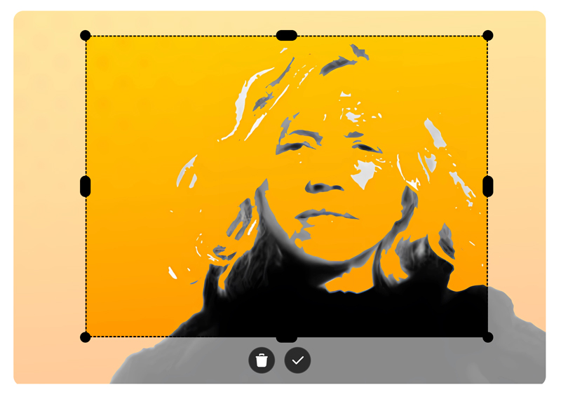
ngx-smart-cropper is a lightweight, modern-looking Angular image cropper designed for real-world applications. It is a standalone, mobile-friendly alternative to ngx-image-cropper, with a clean UI that is meant to be visible to end users.
- Upload and preview images.
- Intuitive drag-to-crop and resize handles.
- Supports fixed or free aspect ratios via an
aspectRatioinput (available in v1.3.0 and later). - Emits cropped images as
base64data. - Responsive design and easy to integrate.
- Auto theme detection: automatically detects the theme (light or dark) based on the image content.
The ngx-smart-cropper library is compatible with the following versions of Angular:
ngx-smart-cropper Version |
Supported Angular Versions |
|---|---|
1.1.9 |
^19.0.0 |
1.2.0 |
^20.0.0 |
1.3.0 |
>=19.0.0 <23.0.0 |
Note:
TheaspectRatioinput is introduced in version 1.3.0 and is not available in earlier versions.
Each library version is compiled for a specific Angular release and is not backwards compatible.
npm install ngx-smart-cropper<input
type="file"
accept="image/*"
(change)="onFileChange($event)"
>
<ngx-smart-cropper
[imageType]="'jpeg'"
[aspectRatio]="1"
[cropX]="50"
[cropY]="50"
[cropWidth]="250"
[cropHeight]="250"
[theme]="'mixed'"
[imageSource]="imageSource"
(imageCroppedEvent)="imageCropped($event)"
></ngx-smart-cropper>
<img [src]="croppedImage" />import { ImageCropperComponent } from 'ngx-smart-cropper';
import { Component } from '@angular/core';
@Component({
standalone: true,
imports: [ImageCropperComponent],
selector: 'my-component',
templateUrl: './my-component.html'
})
export class MyComponent {
croppedImage = '';
imageSource: string | null = null;
onFileChange(event: Event): void {
const input = event.target as HTMLInputElement;
if (!input.files?.length) return;
const file = input.files[0];
const reader = new FileReader();
reader.onload = (e: any) => (this.imageSource = e.target.result);
reader.readAsDataURL(file);
}
imageCropped(event: string) {
this.croppedImage = event;
}
}| Input | Type | Default | Description |
|---|---|---|---|
cropX |
number |
50 |
Initial crop area x-coordinate. |
cropY |
number |
50 |
Initial crop area y-coordinate. |
cropWidth |
number |
150 |
Initial crop width. |
cropHeight |
number |
150 |
Initial crop height. |
aspectRatio |
number | null |
null |
Fixed aspect ratio (e.g. 1 for 1:1, 16/9 for 16:9). Use null for free-form cropping. (Available in v1.3.0+) |
imageType |
'png' | 'jpeg' | 'avif' | 'webp' |
'webp' |
Output file type for cropped image. |
theme |
'light' | 'dark' | 'mixed' | 'auto' |
'auto' |
Auto-adjusts UI theme between light and dark based on image content. |
whitePixelThreshold |
number |
20 |
Threshold (percentage) for switching between dark and light when theme = 'auto'. |
| Output | Type | Description |
|---|---|---|
imageCroppedEvent |
EventEmitter<string> |
Emits the cropped image as a Base64 string. |
MIT License.
This project uses free Tabler Icons for interface elements — modern, customizable SVG icons ideal for any UI.
Feel free to open issues or contribute enhancements on GitHub.