One more custom checkbox switch, but more flexible #26691
Conversation
|
|
||
| $custom-switch-padding-inner: ($custom-switch-track-height - $custom-switch-thumb-height) / 2 !default; | ||
| $custom-switch-padding-outer: 0.5rem !default; | ||
| $custom-switch-transition: all 0.15s ease-in-out !default; |
There was a problem hiding this comment.
Can you only target the transition-properties you want to transition?
| } | ||
| &::after { | ||
| @include gradient-bg($custom-switch-thumb-checked-bg); | ||
| left: custom-switch-thumb-left(1); |
There was a problem hiding this comment.
You're applying transitions on the left properties, It would be better to use transform for this (See https://www.paulirish.com/2012/why-moving-elements-with-translate-is-better-than-posabs-topleft/)
| padding-left: $custom-switch-track-width + $custom-switch-padding-outer - $custom-switch-padding-inner * 2; | ||
| } | ||
| &::before, | ||
| &::after { |
There was a problem hiding this comment.
No need for this, just add the properties in the ::after or ::before selectors. You're increasing the number of selectors with the technique you're using here.
|
This PR needs more documentation, it's not clear to which elements the classes needed to be added. |
| } | ||
| } | ||
| } | ||
| } |
There was a problem hiding this comment.
Add a newline to the end of the file
|
@vchebotarev: can you address @MartijnCuppens comments? And perhaps add a few newlines between selectors for readability too. |
|
Closing due to lack of response. You can comment here and we can re-open the PR, if you decide to resume working on the requested changes. This is an automated reply |
4 participants
Hi.
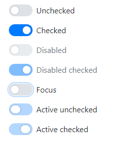
Yes, i know about #23004
But I have more flexible variant of this feature.
It can be configured via scss both android or ios style
It is almost fully based on $custom-control-indicator- vars
It has full support of 'focus', 'active' and 'disabled' states
Active state behavior is simular with ios's with increasing thumb width
All position calculations are scss flexible
I'm not sure about some moments are made corretly in 'bootstrap' style
Branch was created from v4.1.1 tag
Commit contains only scss. If this realisation will be accepted - i'll try to add everything required
Sorry for my english
And this is my first frontend pr, sorry if something is terrible wrong