PolyLookup
PolyLookup is a multi-select control in Model Driven App. It allows users to select one or more items from a list of options.
PolyLookup control supports various types of relationships such as OOTB N-N relationship, custom N-N relationship, and N-N using Connection table.
📝 Note: only OOTB N:N and Custom N:N relationships are available in v1.1.x
- Supports various types of N-N relationships
- Clean design
- Minimal configuration
- Dynamic filtering
- Quick Create
- Optionally output selected as text

| Property | Usage | Type | Description |
|---|---|---|---|
| Bound Field* | bound | SingleLine.Text / SingleLine.TextArea / MultipleLine | The field to host the control and output value |
| Relationship Type* | input | Enum | Many to many / Custom N-N / Connection. Only Many-to-many and Custom N-N are supported in v1.1.x |
| Relationship Name* | input | SingleLine.Text | N-N: The relationship schema name to the associated table. Custom N-N: The relationship schema name from the current table to the intermediate table. |
| Relationship 2 Name* (required for Custom N-N) | input | SingleLine.Text | N-N: Not applicable. Custom N-N: The relationship schema name from the intermediate table to the associated table. |
| Should Output Selected Text* | input | Enum | Whether the control should output selected items as text |
| Output Selected Field (required if you want to use the control in Create form) | input | SingleLine.Text / SingleLine.TextArea / MultipleLine | The field to output the selected records as a JSON array. Can be the same as "Bound Field" |
| Lookup View | input | SingleLine.Text | The view name for the suggestion list when searching. Default: use system Lookup View when empty or not found |
| Item Limit | input | Whole.None | Maximum number of selected items |
| Allow Quick Create | input | Enum (Yes/No) | Enable or disable the Quick Create button |
** is a required prop
erDiagram
    COURSE }o--o{ CATEGORY : relationship_1
erDiagram
    STUDENT ||--o{ ENROLLMENT : relationship_1
    CLASS ||--o{ ENROLLMENT : relationship_2
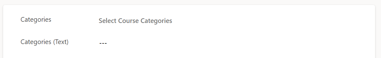
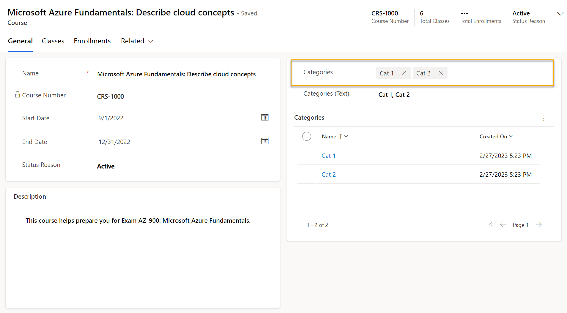
"Course Categories" is automatically retrieved from Table Plural Name

When user first clicks on the control and the search term is empty, it will load the first 50 records from the associated table.
The page size 50 is retrieved from the user's from personal settings.


When user starts typing, the control will search for records having Primary Name Attribute starts with the search term from the associated table.
There is a 100ms delay before the control starts searching.

The Quick Create button helps users quickly create a new option right in the current form without navigating away.
The Quick Create button can open the table's Quick Create Form, if "Allow Quick Create" is enabled in table settings and a Quick Create form is created.
❗ Important: an additional requirement for Quick Create Form to display is that there must be a lookup to the associated table and the lookup field is required. After you verified that the Quick Create Form is shown correctly by clicking the Quick Create button, you can safely delete the lookup field if you don't need it.
If "Allow Quick Create" table setting isn't enabled, the main form will be used as a dialog.

The Lookup View prop takes the name of a System View or your custom view of the associated table. The view definition will be used to sort and filter the suggestion list. If it is blank or not found the control will fall back to use the OOTB Lookup View.
This helps when you want to narrow down the suggestions list to some specific conditions and/or sort the suggestion list in a specific order.
📝 Note: Make sure you don't have two or more views with the same name.
❗ Important: Lookup View may not work if it's too long/complex with lots of conditions. This is because the component is using the FetchXML in the Lookup View to retrieve data using Web API
GETmethod and the maximum length of the URL is about 8000 characters. But the fetchxml will need to be URL encoded, so we only have about 4600 characters maximum for the actual FetchXML. It should be enough in most cases.

Another advanced feature is dynamic templating. This helps you to insert data from the current record into your lookup field.
Dynamic templating syntax: {{ field_logical_name_on_form }}
With nested objects such as a Lookup field, you can access its id or name using {{ lookup_field.id }} or {{ lookup_field.name }}
❗ Important: the fields you want to insert to the Lookup View must be available on the form, either visible or invisible
Reserved Token {{PolyLookupSearch}} is a placeholder for the search text of the control.

The Lookup View is also used to show information in the suggestion list. When there are more than one columns in the view, there will be a toggle button to show/hide more details for each suggestion item.

The suggestion list only shows the first page of the results. The "Load more" button is available and the bottom of the list. Clicking the button will load the second page and add results to the list, and the button won't be available until users start searching again. There are indications at the end of the list to show if there are more results or not.
This is for the component to perform better and provide a better user experience as users need to refine the list using the search box instead of browsing through multiple pages in the suggestion list.


Selected items are retrieved from the underlying relationship. When user selects an item from the suggestion list, the control will create a new associated record in the relationship. And when user removes an item from the selected items, the control will delete the associated record in the relationship.
Because of this, the component can't update the relationship in create form directly before the record is saved. You'll need to handle this case by yourself using output selected items feature below.

The selected items can be output as a comma-separated string to the Bound Field. When the selected items are changed, output will be updated accordingly.
You can leverage this feature to handle the change event of the output field to add more logic when selected items are changed.
This can be enabled optionally in the control properties.

Additionally, the selected items can be output as a JSON array with the below schema. You'll need to specify what field you want to output the result to in the Output Selected Field.
[{
  "id": "<Selected item Guid>",
  "name": "<Selected item name>",
  "etn": "<Selected item entity name>"
},
{
  "id": "<Selected item Guid>",
  "name": "<Selected item name>",
  "etn": "<Selected item entity name>"
}]
You must use this feature if you want to use the component in the create form. Then create a plugin triggered after the record is saved/created, the plugin should associate the current record with selected records stored in the JSON array.
Please see the sample plugin under Samples folder here
📝 Note: you don't need to handle this on update because the component can update the relationship directly when the current record already exists.
When the field is set as read-only in form designer, the control is disabled respectively.


Should Output Selected Text should be enabled for this to work
- ❌ Association doesn't work in create form as related records can only be linked when the current record exists after saved.
- ❌ Lookup View may not work if it's too long/complex with lots of conditions
- ❌ Bulk edit is not supported
- ❌ Can't output selected items larger than output field's maximum length
- ❌ N:N relationship is not supported in Mobile Offline Mode. More details here: https://learn.microsoft.com/en-us/power-apps/mobile/offline-capabilities#limitations
- Upgraded handlebars fixing errors when building the component.
- Fixed a bug in custom N-N mode, selected items is not showing when associated table primary id column and intersect table lookup column have different logical names.
- Fixed a bug where suggestion list is not showing when lookup view name is blank.
- Fixed a bug where selected values are replicated when there are more than one PolyLookup components on the form.
- Supports Custom N:N relationship type
- Added ability to search using a System View for Lookup View
- Fix JSON output in the create form
- Added load more button for paging
- Added prop to output selected items as a JSON array
- Added suggestion item details using Lookup View
- Added Dynamic Search Filter
- Added Quick Create button
- Added page limit prop
- First release
- Permission Handling
- Error Handling